
 When you’re establishing your brand or company one of the most important steps is to build brand recognition. You want people to know who you are and what you do simply by seeing your logo. Think Nike. The swoosh has become iconic and Nike’s consistent use of their visual branding is an example for us all.
If you don’t happen to have a million dollar marketing budget and giant team of marketing experts, what do you do? You focus on the basics. You use the marketing assets you do have consistently and with a purpose.
If you want to build brand recognition, use your logo consistently
At a very basic level you should use the same version of your logo everywhere. Consistency means that no matter where you place your logo, it should always have the same colors, same fonts, same shape and dimension.
I say “always,” but exceptions certainly exist. There are times when a black and white logo is needed and that’s okay. The consistency you want to focus on is keeping the color version the same – don’t have green one day and purple the next. If you’ve updated your logo at some point make sure that only the current version of your logo is out there and you don’t have different versions in different places.
The next step is ensuring that you are actually using your logo to build brand recognition. Sounds obvious, but let’s a look at a local Aveda Salon and how they have set up their Facebook page.
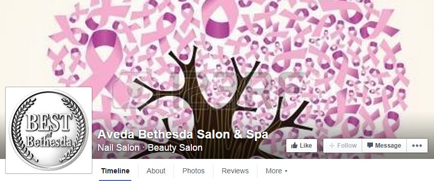
Notice that the page’s profile picture is a logo for the “Best of Bethesda,” an award given out by Bethesda Magazine instead of their company logo. Obviously the Bethesda Aveda wants to call attention to their award, but in doing so they are sacrificing their brand recognition. While their award might look great in the header, it does not help them build brand recognition through the posts in the newsfeed, which is where most folks see content.
The takeaway?
- On social networks, build brand recognition by using your logo consistently as the profile image.
- Use the same version of your logo on every social network, your website and any other channel.
Build a stronger brand by being consistent across all platforms
Logos are the anchor of your visual brand, but all of the colors and images you use also contribute to your visual brand. Ideally all of the images you are using on your website, social networks and in email marketing should work together and create a seamless experience.
Continuing with our Aveda example, take a look at their website and compare it to the Facebook header above. There’s nothing wrong with either of these layouts, but they don’t really go together.

Sure the Facebook page is promoting Breast Cancer Awareness Month, and that’s wonderful, but where is that on their website?
When you click over from a bright pink Facebook image to a green and black website it doesn’t seem to fit a consistent theme and it might make people wonder if they are in the right place. Is it enough to make you would leave the website? Probably not, but compare it to Aveda’s brand Facebook page and website below.


Notice that the Aveda logo is placed in the profile picture and how there is consistency from Facebook to the website. It’s a seamless transition that lets you know you landed in the right spot.
What’s the takeaway here? Using consistent imagery across multiple platforms will help your customers know they are in the right place. These easy and seamless transitions not only help build brand recognition, it also builds trust in your brand.
Have you considered how the different images you are using work together? I’d love hear if these thoughts gave you a fresh perspective.


