 There’s a reason why asking someone about their favorite color is a way to get to know them. People have vastly different preferences around color and it impacts how they see the world.
Here’s an example: my junior high, high school, and college colors were green and gold. While I have very fond memories of cheering for the green and gold during football games, I also shiver at the memory of the truly awful gym uniforms I had to wear.
Any designer that has ever worked for me has quickly learned that green and gold is not a color combination I want to use, because it evokes a weird mix of emotions for me.
You, on the other hand, may see green and gold, and think nothing of it. However, I’d be willing to bet that you feel strongly about certain other colors, be it pink, orange or brown.
What colors mean for your brand
It’s fair to say that few things are more subjective than color preferences, but colors do have meanings that are widely recognized.
There is no right or wrong way to select your brand colors, but when you are establishing a brand, it’s worth considering the meaning behind certain colors – both good and bad.
Red
 Red is widely accepted as the color of passion and strong emotions – both love and anger. It’s universally accepted to signal danger, but can also represent courage, strength and power.
Because it’s stimulating, vibrant, and exciting, red can be used to incite action.
Cautions: it’s an aggressive color – both in emotion and can be harsh on the eyes if used liberally (especially online).
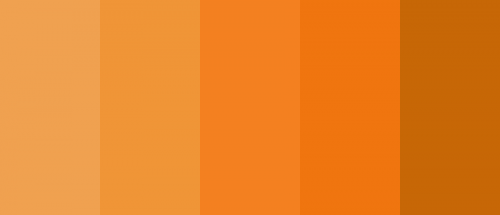 Orange
Orange is thought to be the color of encouragement and conveys excitement, warmth and enthusiasm.
Often considered the color of the extraverts, orange can be motivational, and is especially appealing to young people.
Cautions: negative connotations of orange include insincerity, exhibitionism and attention-seeking. It also regularly appears on the list of least-favorite colors – for both men and women.
 Yellow
Yellow is the color of optimism that often conveys a youthful, fresh energy. Because it’s the color of sunshine, yellow can be used to uplift and illuminate.
Scientific notes: the eye recognizes yellow above all colors, so it’s often used as an attention-grabber. Studies have also shown that yellow stimulates the left side of the brain, so it can aid clear-thinking and quick decision making.
Cautions: on the downside, yellow is associated with cowardice and can induce anxiety.
 Blue
Blue
As the color of both water and the sky, blue is thought to convey calm, tranquility and peace. It’s also known to be the color of trust, loyalty and integrity.
Blue also expresses conservatism, which could be good or bad for you.
Cautions: blue is the color of depression, and strongly associated with cold (temperatures and feelings).
Blue also tends to suppress the appetite, so it may not be the best choice for food-related brands.
 Green
Green
In additional to being used for money, green is the color of nature so it’s used to showcase growth, health and life. For many people it’s a peaceful color and evokes feeling of abundance and plenty.
Cautions: it’s hard to believe that green is seen as the color of both generosity and jealousy, but green can be perceived as materialistic and possessive. Interestingly, the fact that it represents new life, can also indicate inexperience to many.
 Brown
Brown
As the color of the earth, brown is all about stability, comfort and safety. Some people perceive brown as reliable and wholesome, while others find it dull.
Cautions: brown is one of the least favored colors around. Perhaps because it’s lack of vibrancy, brown can indicate stinginess or frugality and actually suppresses emotions.
On its own brown can feel overly simple and unsophisticated, so you may be better off using it as a contrast color, than a primary one.
 Black
Black
Black is dark and mysterious, which could be a good or a bad thing depending on your perception.
It’s a strong color that is formal, and often indicates sophistication and elegance (think of black tie events). The simplicity of black makes it a strong contrast color, which allows other colors to stand out.
Cautions: black is the color of evil, and widely considered unfriendly, intimidating and pessimistic.
Selecting your shades
Thinking things will get easier when you dive into different shades? Not so fast.
Take the color scarlet. Cardinals of the Roman Catholic Church wear scarlet as the color of the blood of Christ and Christian martyrs. Yet the book, The Scarlet Letter, has associated scarlet with sin and adultery.
So what to do?
If it’s your brand, you need to think about what colors mean to YOU. A graphic designer can help you put together a color combination to solidify your visual brand, but you have to feel good about the colors first.
If you can figure out a primary shade that resonates with you, try tinkering around with this tool to find different color combinations.
Need help figuring this out? We’re only an email away.


